728x90
Styled component 를 이용해서 각 다른 css 효과를 주기위해
버튼 3개를 만들어 보면서 각각 다르게 적용해 보았다.
props를 이용해서 해보았다....
어렵ㄷㅏ... 😂
바로 적용한 코드 적고, 그 밑에주석으로 설명을 좀 덧붙여 보았다.
Practice.js (자식 컴포넌트)
import styled, { css } from 'styled-components';

const StyledButton = styled.button`
  padding: 6px 12px;
  border-radius: 8px;
  border: 1px solid lightgray;
  font-size: 1rem;
  line-height: 1.5;

  color: ${p => p.color || 'gray'};
  background: ${p => p.background || 'white'};
  //color가 부여된것이 없다면 gray로
  //background가 부여된것이 없다면 white로

  ${p =>
    p.primary &&
    css`
      color: white;
      background-color: navy;
      border: navy;
    `}
`;
 //primary만 적용하고싶을때 ${(p)=>p.primay && (primary일때만 이라는뜻)}
 //css 특정만 지정하고싶을때 같이 import 해 줘야함 (바로뒤에 중괄호가 아닌 ``적어준 후 css문법적용)

const Practice = ({ children, ...props }) => {
  return <StyledButton {...props}>{children}</StyledButton>;
};

//...props (스프레드 연산자) 안에는 color, background, primary 한거번에 다 들어가있음

export default Practice;
** props로 줄때, 인자와 같이 return 문에 넣어주기 !!
이때, 스프레드 연산자 꼭 이용하기
Login.js (부모 컴포넌트)
import React from 'react';
import Practice from './Practice';

const Login = () => {
  return (
    <div>
      <Practice>Button</Practice>
      <Practice color="pink" background="lightblue">
        Button
      </Practice>
      <Practice primary>Primary Button</Practice>
    </div>
  );
};

export default Login;
결과

${ ... } 안에 값(변수) 사용하기
const SIZES = {
  large: 24,
  medium: 20,
  small: 16
};

const Button = styled.button`
  ...
  font-size: ${SIZES['medium']}px;
예시 코드에서 ${SIZES['medium']} 부분은 숫자 20을 뜻하기 때문에,
font-size: ${SIZES['medium']}px;는 font-size: 20px;란 코드이다.
구조분해하기
font-size: ${({ size }) => SIZES[size]}px;
논리연산자 사용하기
const Button = styled.button`
  ...
  ${({ round }) => round && `
      border-radius: 9999px;
    `}
`;
= round 값이 true 이면, border-radius 문자열이 리턴되고, false면 아무것도 리턴되지 않는다.
삼항연산자로 표현하기
border-radius: ${({ round }) => round ? `9999px` : `3px`};
적용
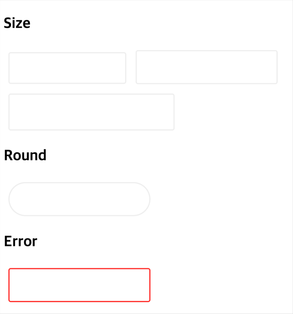
- 크기를 지정하는 size Prop
- large 인 경우 font-size: 24px
- medium 인 경우 font-size: 20px
- small 인 경우 font-size: 16px
- size가 없거나 잘못된 값인 경우에는 medium 으로 처리하기
- 둥근 모양을 지정하는 round Prop
- true 인 경우 border-radius: 9999px
- false 인 경우 border-radius: 4px
- 에러 상태를 표시하는 error Prop
- true 인 경우 border: 2px solid #f44336
- 포커스 된 경우 테두리 색상은 그대로 #f44336가 되도록 처리하기
부모 컴포넌트
//App.js

import styled from 'styled-components';
import Input from './Input';

const Container = styled.div`
  ${Input} {
    margin: 8px;
  }
`;

function App() {
  return (
    <Container>
      <h2>Size</h2>
      <Input size="small" />
      <Input size="medium" />
      <Input size="large" />
      <h2>Round</h2>
      <Input round />
      <h2>Error</h2>
      <Input error />
    </Container>
  );
}
//Input.js
import styled from 'styled-components';
const SIZES ={
large:24,
medium:20,
small:16
};
const Input = styled.input`
border: 2px solid #eeeeee;
border-radius: 4px;
outline: none;
padding: 16px;
font-size : ${({size})=> SIZES[size] ?? SIZES['medium']}px;;
border-radius: ${({round})=> (round? `9999px`:`4px`)};
border: 2px solid ${({error})=> (error ? `#f44336` : `#eeeeee`)};
&:focus {
border-color: ${({error})=> (error ? `#f44336` : `#7760b4`)};;
}
`;
export default Input;결과
728x90
'프론트앤드 > [React]' 카테고리의 다른 글
| [React] 페이지 상위로 가는 button (0) | 2023.03.06 |
|---|---|
| [React] 카카오 API 연결 로그인 (0) | 2023.02.28 |
| [React] Styled component (0) | 2023.02.26 |
| [React] useState 조건부 렌더링 (0) | 2023.02.22 |
| [React] useState (count하기, 비동기) (0) | 2023.02.22 |